This post contains affiliate links. I may receive compensation if you buy something. Read my disclosure for more details.
TLDR: Introduction to Tableau
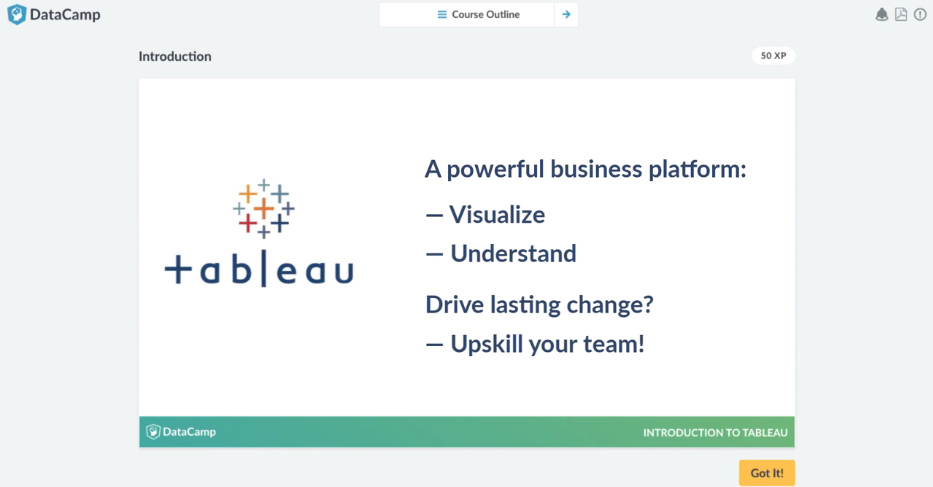
DataCamp Tableau Course
💥 Tableau is a tool used for data analysis and data visualization.
💥 You don’t need technical or programming skills to use Tableau.
💥 DataCamp will teach you how to effectively use Tableau to your and your team’s advantage.
💥 You can also learn about Power BI and Oracle on DataCamp.
Sign up for Introduction to Tableau
👉 here. 👈
What is Tableau used for?
Tableau is the fastest growing interactive data visualization tool used in the Business Intelligence (BI) industry.
It’s used to simplify raw data into an understandable format. Data is in the form of dashboards and worksheets.
And with the drag-and-drop interface, you can build dashboards in hours instead of weeks.
Best part?
You do not need any technical or programming skills to use Tableau.
So even non-technical users can create a customized dashboard.
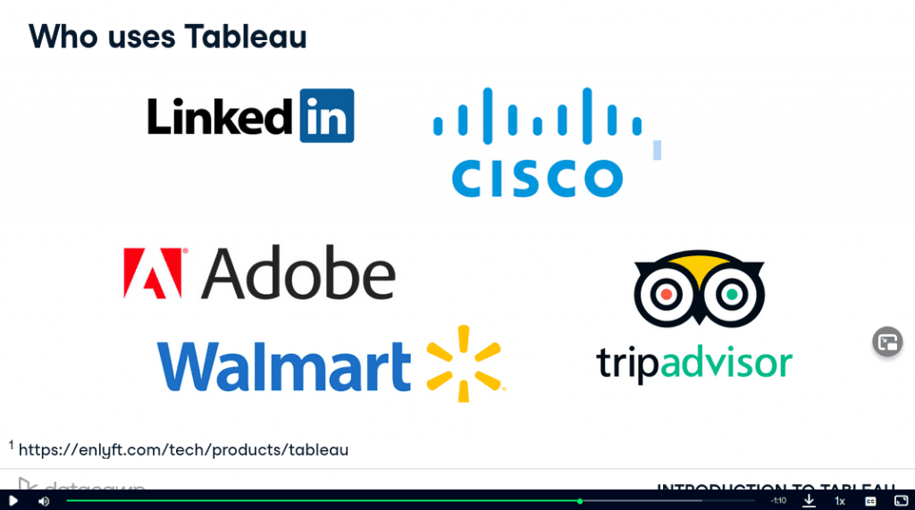
Who uses Tableau?
Tableau is most commonly used by data analysts, business analysts and quantitative analysts. Tableau is for anyone who wants to visualize data on a daily basis.
Some popular companies that use Tableau include LinkedIn, Cisco, Adobe, Walmart, and Tripadvisor.
✨ DataCamp Tableau Course: Introduction to Tableau
⚠️ Level: Beginner
📖 Chapters: 4 chapters with 70 exercises
👨🏫 Learning style: Interactive text and 29 videos
⏲️ Estimated completion time: 4 hours
🎮 Gamified learning environment: Yes
Introduction to Tableau is broken down into 4 chapters:
- Getting Started with Tableau
- Building and Customizing Visualizations
- Digging Deeper
- Presenting Your Data
Best part?
It includes a Microsoft Virtual Machine (VM) right in the browser.
That means you can read the instructions while you work side by side with Tableau.
Let’s take a closer look.
DataCamp Tableau Course Content
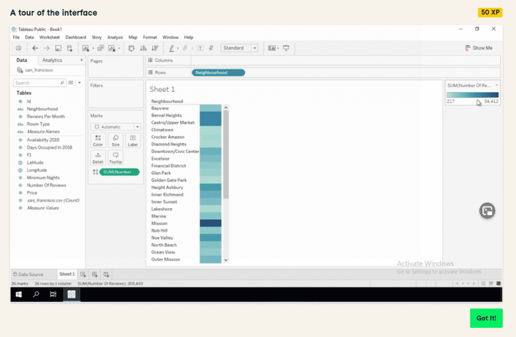
Chapter I: Getting Started with Tableau
Here you’ll learn about Tableau fundamentals like how to:
- connect data sources
- use the drag-and-drop interface
- create visualizations
And more.
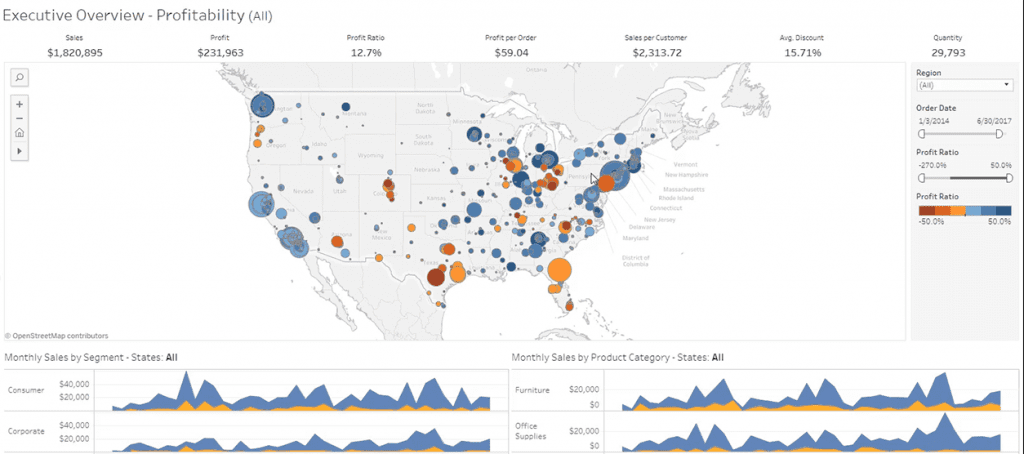
You’ll gain a real-world understanding while exploring Tableau by looking at an Airbnb dataset and New York’s neighborhood prices.
Takeaways
By the end of this chapter, you’ll know how to use Tableau and build visualizations.
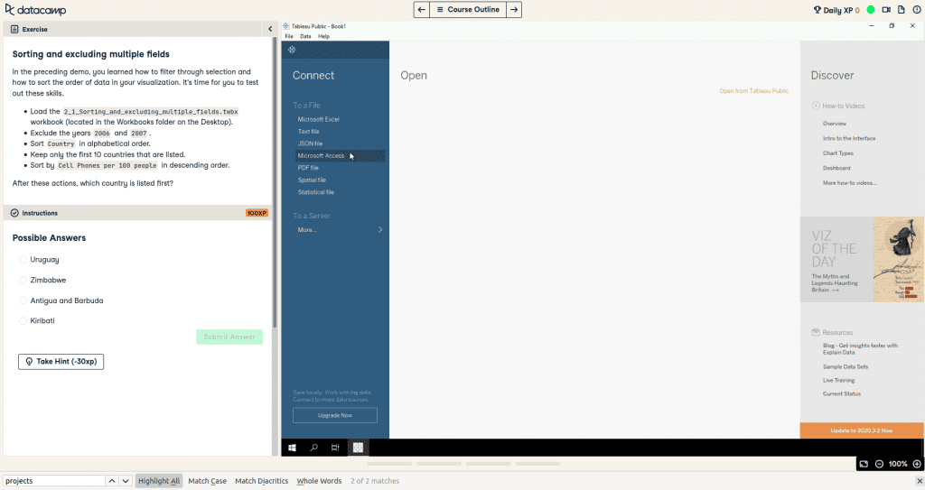
Chapter II: Building and Customizing Visualizations
In this chapter you’ll review Tableau concepts for analyzing and exploring data.
Then you’ll learn how to:
- slice data with filters
- create new columns with your own calculations
- aggregate dimensions and measures in a view
And beyond.
You’ll do all this (and more) by working with educational, social and infrastructure datasets like CO2 emissions, GDP per capita and life expectancy.
Takeaways
By the end of this chapter, you’ll know how to manipulate data and create columns.
Chapter III: Digging Deeper
This is where the course gets a bit heavier. You’ll learn how to:
- visualize geographic data
- plot data onto a map visualization
- work with dates in Tableau
- explore how data changes over time
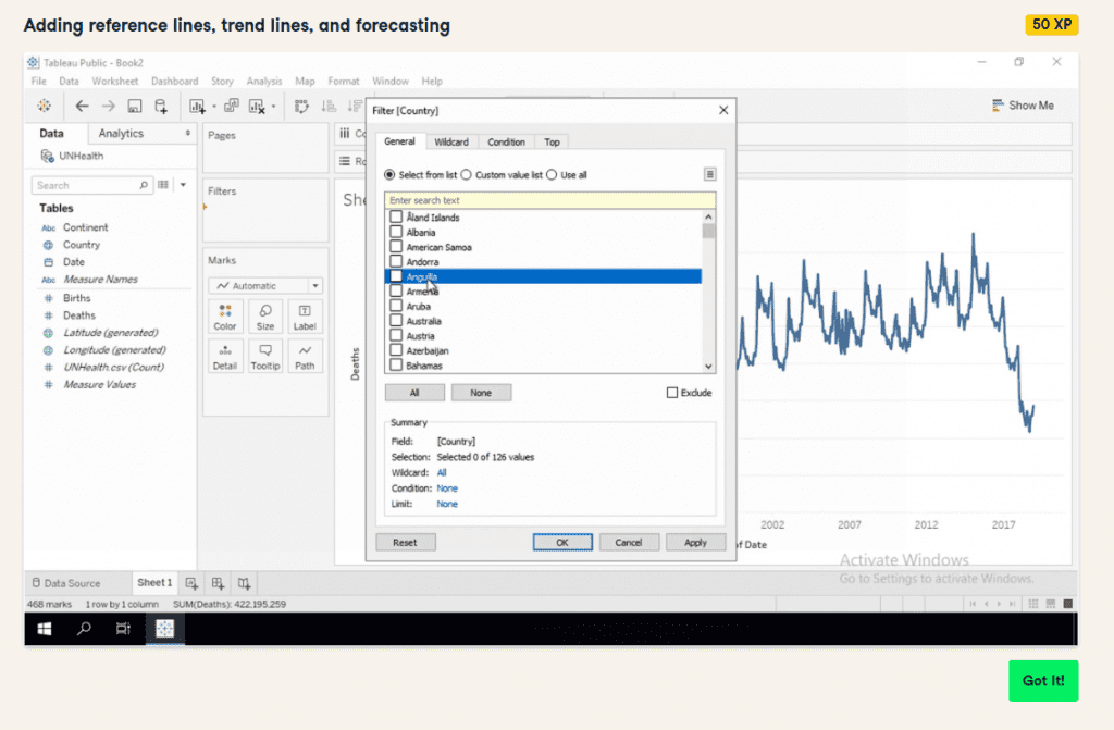
- add reference, trend and forecasting lines
And you’ll do all this while exploring worldwide health statistics.
Takeaways
By the end of this chapter, you’ll know how to map geographic data, work with dates and more.
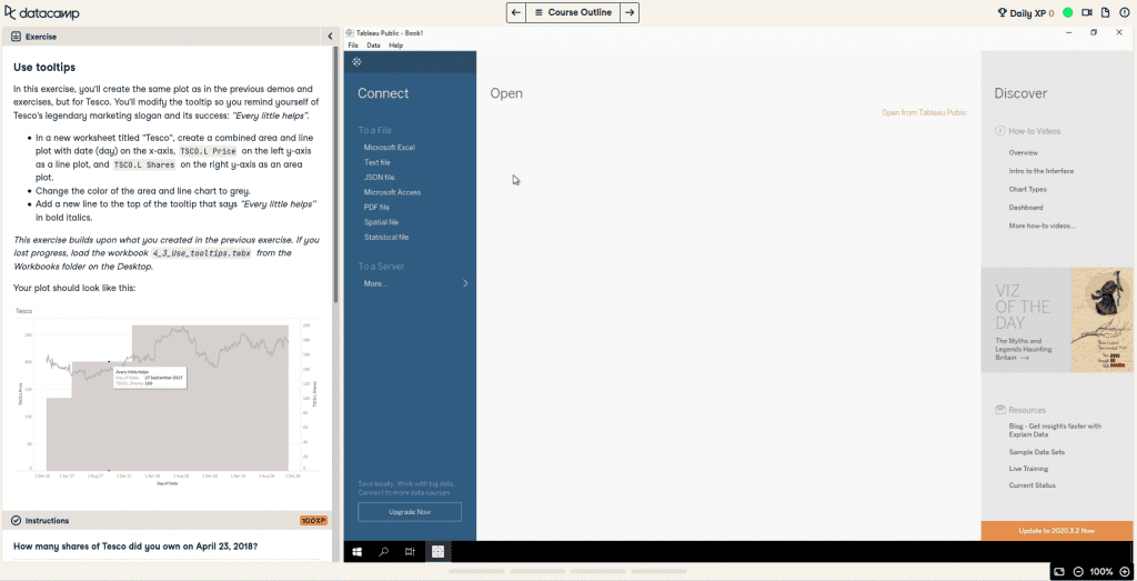
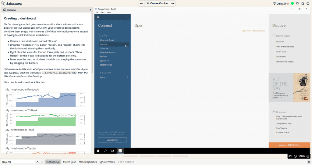
Chapter IV: Presenting Your Data
In Presenting your Data, you’ll learn:
- best practices for formatting and presenting data
- how to create dashboards
- use dashboards to share insights
You’ll use daily stock prices and foreign exchange rate data to solidify concepts.
Takeaways
By the end of this chapter, you’ll learn how to format your visualizations and present your findings using tools like Dashboard and Stories.
🤝 Community & Support
DataCamp has a robust community where you can chat with other learners, listen to podcasts, read news and more.
And with their Priority Support, you’ll be able to get answers to any hurdles you may have with Tableau.
💰 Cost
Introduction to Tableau is only available for certain DataCamp subscriptions:
Premium Personal Plan – Get access to exclusive Tableau, Power BI and Oracle content for $33.25 per month
Enterprise Business Plan – Exclusive Tableau, Power BI and Oracle content priced per user or hourly cost
Sign up for the DataCamp course Introduction to Tableau
👉 here. 👈
So what’s the difference between Tableau and Power BI?
The purpose of Tableau and Power BI is to help users understand data.
Power BI starts off with data manipulation, then leads to data visualization. But it can only handle a limited volume of data.
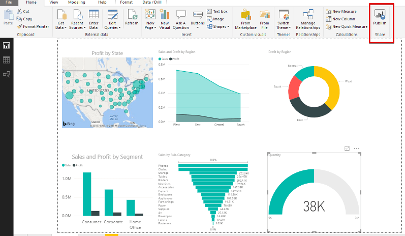
Tableau is better for its data visualization functionality. It can handle a large amount of data with better performance than Power BI.
Both are generally user-friendly.
🔥 Geena’s Hot Take:
Learning Tableau was like eating candy. It was fun diving right into the graphs and charts.
Power BI felt like I was trying to waste the workday at a corporate job. With all the work in Excel, my eyes glazed over.
I understand the need for Power BI but in this circumstance, Tableau takes the cake.
What is the best way to learn Tableau?
There are many ways to learn Tableau:
- read books
- hire someone to train your team
- seek out community resources
But we prefer the DataCamp course Introduction to Tableau.
With this interactive and immersive course, you’ll learn how to visualize and understand data. All while leveling up your team.
Plus, you can follow along with the instructors in real-time.
DataCamp Tableau Course: Conclusion
So, is the DataCamp Introduction to Tableau course worth it?
If you need a user-friendly tool to convert your data into understandable data visualizations, then Introduction to Tableau is for you.
✅ Remember, users don’t need technical or programming skills to use Tableau.
✅ With this DataCamp course you’ll learn how to effectively use Tableau to your and your team’s advantage.
✅ In addition to Tableau, you can learn about Power BI and Oracle on DataCamp.
Sign up for Introduction to Tableau
👉 here. 👈
Not sure if Tableau is for you?
We review plenty of different courses. For example, we review DataCamp’s Introduction to Power BI. It’s similar to Tableau and might be more your speed. Read our full review here.
Is there a DataCamp Tableau course?
Yes. Datacamp’s course Introduction to Tableau is an interactive and immersive course. You’ll learn how to visualize and understand data in a beginner-friendly environment. You do not need any technical or programming skills for this course. It will teach you Tableau basics from the ground up.
Where can I learn Tableau basics?
There are many ways to learn Tableau. You can read books, hire someone to train your time, seek out Tableau community resources and more. But we prefer the DataCamp course Introduction to Tableau. It’s a 4 hour course with interactive text and video. You’ll learn how to use Tableau in a beginner-friendly environment. You do not need technical or programming skills for this DataCamp Tableau course.
What is Tableau used for?
Tableau is the fastest growing interactive data visualization tool used in the Business Intelligence (BI) industry. It’s used to simplify raw data into an understandable format. With Tableau, data is in the form of dashboards and worksheets.